Pre-Proposal - Visual Identity

Status
Not open for further replies.
I find it hard to distinguish between “what I like” and “what is best for Dash,” for the reason I like something better is that I think it is best for Dash! I also don’t have strong opinions about things like this; they seem to be a lot of sound and fury, signifying nothing (or little). But at the same time, I want Dash to put its best foot forward, so I hope the best design wins.

That being said, I like the T&C one better of the two. Specifically, I like it because I think it is much simpler, which will resonate better with a wider, multi-cultural audience. Further, the T&C branding fits a currency/payment system best, in my opinion, and it also is a better evolution of the current branding.

I don’t like the “DD” in the Ogilvy design. I like the idea of a logo image (like Ethereum has), but the DD makes little sense and seems derivative. I also dislike the multiple colors of the Ogilvy design; they seem to present an image of weakness to me. I think the Ogilvy design is much more likely to age poorly as well; I could see it looking embarassing in just a few years.
 
Spot the Dash logos

Funny thing is that I was drawn to the T & C logo in the image, maybe because it was in the center? IDK..

Why does DASH need rebranding again? Maybe this wasn't such a good idea?

If 83% of those surveyed by O&M had never heard of DASH, then 17% have heard of DASH. Let's build on that 17% instead of pushing multi-colored double-Ds out there.
 
Where did O&M do their research? I live in conservative America and I guarantee you that their logo would not only be soundly rejected, it would be ridiculed. The conservative class should not be ignored, they have a much greater need for Dash than the left does (which this logo is clearly targeting) as it's the conservatives who are being censored on social platforms, who are being targeted in the media, it's the gun shops who are losing banking access, etc.

Takes about a half hour to read through all the OPs links. O&M surveys were done in Japan, Germany, USA, UK, & Russia.
No input from Africa or Latin America.
 
My reaction to O+M logo...

dUmqQ0x.gif


My reaction to T&C logo...

K5YzUTz.gif
 
Well, the people I showed the logos picked O&M immediately but I have read some good arguments why this is not a good fit for dash.

for example, the double D representing the blockchain. The end user should never have to worry about the blockchain it's about being digital cash.

And I never liked the T & C logo.

So at this point, I would be for sticking with the current logo.
We should focus on the product and building the brand as it is.
Though I would be open to some colour changes to the current logo.
 
One day later, I agree that the current logo is really great, and the "a" T&C logo is a bit undefined. The Dash "D" truly is iconic, or will be once the product is actually usable by everyone (more work on this please) and the forward leaning makes it look like it's really fast. I do like the softening of the corners as seen below, (attachment 6705, second image) but that's it.

I was hoping for something really good from O&M but I'm disappointed.
The color and scaling problems are serious, there is too much detail in the DD for it too be seen well at icon size or from a distance. And that font... yuk.

The T&C attempt is better but still not something I would vote for (I don't have a vote.)

The point made above about the cost, time, and difficulties in updating, for the start-up level people working with Dash around the world, is valid.

I would argue for keeping the current logo.

The current logo was never pitched like a design though, it was just chosen/won. It does have some great features.

The negative space in the A (being a C) says both "Dash" and DcASH".
The blockchain is already represented with the block letters of the name. No stacking necessary.

View attachment 6704

I was disappointed with the lines in the current logo back when it showed up though.
The thickness varies strangely and those inside corners are ridiculous.
But those can be fixed so it's easier on the eyes.
Here's a quick (sloppy) example tweak I did to fix those (also shortening the letters horizontally).

View attachment 6705

And of course, more could be done in this vein...

View attachment 6706

Cheers,
 
We risk having an unnecessary hate it or love it logo change and divide/split in community or we could keep on trucking with what we already have and keep everyone happy. Everyone was happy up until now. Nothing has changed in my eyes. I believe MNO's were most interested and eager for a major advertising & marketing strategy campaign push in preparation for Evolution over rebranding.

Remember this, we're still waiting on Core to announce what Dash Evolution's final name will be. All this commotion and debate could potentially be wasted energy and emotion. If Core go with Dashpay for example we'll be doing this all over again. Evolution is just a prototype name. So keep your eye on the ball. I'm taking a long term outlook. Not short term one hit wonder. Keeping current logo we have now IS a wise move and tried and tested approach.

Vote #Remain

upload_2018-3-24_19-59-48.png
 
Last edited:
@demo, what's that in E's left hand? Is it a key or a pistol?
A key-pistol maybe?:p
images


A key-pistol fits as symbol of crypto war! As @TanteStefana said:

Tantestefana said:
The cryptocurrency movement started by the unknown Satoshi Nakamoto, is a declaration of war against the incumbent banking system. There is no sweeter way of saying it. Of course nobody wants actual war, or any type of violence, however the incumbent system has utterly failed the people of the world in so many ways, and are undoubtedly the cause and source of all the wars around the world; the proof of which would be far too long a book to write here. This war can only be won Gandhi style, Martin Luther King Jr. style. We must win the hearts and minds of the world. We must grab as big a foothold in countries who have been decimated by bad governments and bankers. What you signed on for here is not a “business” that runs a balance sheet and must show profit. You signed on to a war.
 
Last edited:
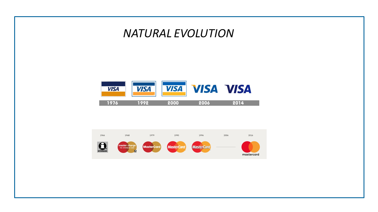
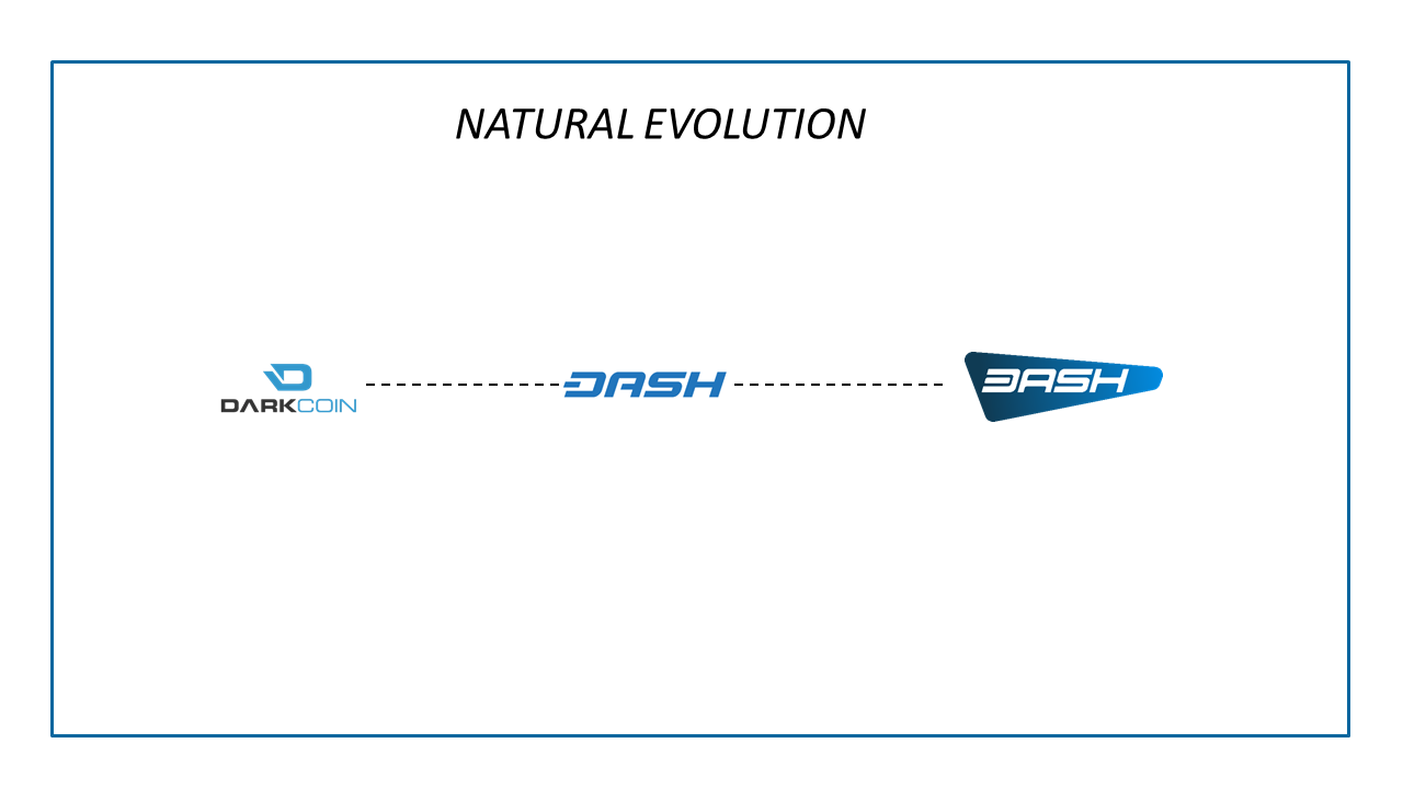
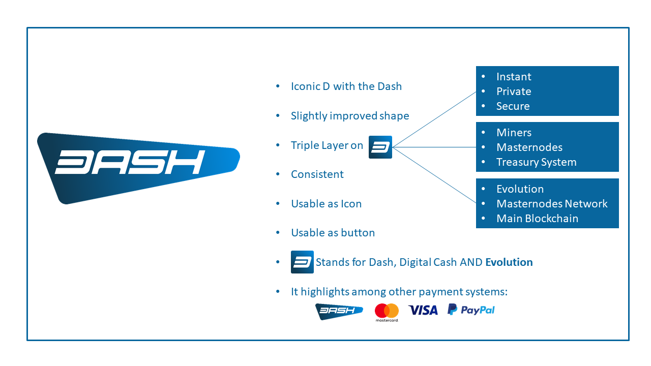
How a logo evolves from grassroots/iconic and retains the clever bits while refining the logo and staying on trend. Posted on request from Discord DN.
 

Attachments

  • TC_Dash Evolution_Big Picture_324 (2).pdf
    472.3 KB · Views: 277
Funny thing is that I was drawn to the T & C logo in the image, maybe because it was in the center? IDK..

Why does DASH need rebranding again? Maybe this wasn't such a good idea?

If 83% of those surveyed by O&M had never heard of DASH, then 17% have heard of DASH. Let's build on that 17% instead of pushing multi-colored double-Ds out there.

Dash's goal is to reach the majority, not the minority who are already a part of the crypto community, and certainly not the sub-group of that minority that are already familiar with Dash.
 
Well, the people I showed the logos picked O&M immediately but I have read some good arguments why this is not a good fit for dash.

for example, the double D representing the blockchain. The end user should never have to worry about the blockchain it's about being digital cash.

And I never liked the T & C logo.

So at this point, I would be for sticking with the current logo.
We should focus on the product and building the brand as it is.
Though I would be open to some colour changes to the current logo.

No regular person is going to give a single duff about what the double d's in the logo represent. All they will care about is the user experience.

As it seems obvious that the majority of regular people prefer the O&M logo, I think the only relevant arguments against it are technical ones, such as legibility at a small size and consistently reproducing the colour gradients.
 
DASH Evolution won't be a one and done, drop the mic reveal. Evolution is DASH and DASH is Evolution. It is another step forward for the network, designed to facilitate adoption.
Perhaps rebranding would be more appropriate once we are further down the road? O&M has offered to do this if the MNOs vote NO on both choices and opt to stay with the current logo.
 
No regular person is going to give a single duff about what the double d's in the logo represent. All they will care about is the user experience.

As it seems obvious that the majority of regular people prefer the O&M logo, I think the only relevant arguments against it are technical ones, such as legibility at a small size and consistently reproducing the colour gradients.

Everyone keeps saying the data says that people prefer the O&M logo but that's not what the data says. Their data says that people preferred the O&M logo over a modified version of Dash's original logo and an even worse version of O&M's logo. The survey was set up to favor O&M's logo from the outset. It's not valid research.
 
- Although our current logo has a lot of merit, we should have a logo designed by experienced professionals and not (talented) members of the community if we are to become a globally recognised brand.

- T&C seems like a better company to design our brand than O&M who seem better suited to advertising & marketing existing brands than creating new brands.

- The data to support the O&M logo is pretty low quality imo, even their truly horrible logo #3 fared much better than our current logo in the tests they used which should set alarm bells ringing. $80k is peanuts to spend on market research and brand design. I think it would be a mistake to vote for O&M based on the 'data' if you otherwise prefer another option.

- We have NO data testing the T&C logo, so it's not a fair comparison. For all we know, the T&C logo may test better.

- The T&C design is softer and less robotic looking than our existing logo and should appeal to a wider audience of non-technical people. It gives the impression of user-friendliness which is an important aspect of the Dash brand that we want to convey. At the same time, it retains the iconic Dashmark that we all know and love and is not such a radical change as to invalidate existing marketing materials that are being used in Africa, Venezuela etc.

- O&M's design may be initially eye-catching, but I do not think it has any longevity. T&C's logo will still look good a year from now.

- I don't feel like O&M respects Dash, it's history, and the change we're making in the world. I feel like the significance of Dash is completely lost on them. We're just another internet start up to them, a 'blockchain' brand for their portfolio, nothing more.

For those reasons my votes will go to T&C.
 
Last edited:
A couple of observations: First of all, "dash is digital cash" is just a strap line, it's not the full story. Dash is far more than digital cash, it's a Decentralized Autonomous Organization. So while some people talk of currency symbols etc, the bigger picture is that this Dash DAO is changing the world.

Think beyond money. For example, if done correctly, dash usernames have the potential (long shot), of replacing government controlled DNS. That's one step closer to uncensorable content. Dash IS the innovator. We delivered the first masternodes and the first functional DAO. We have the DAPI coming up, hardware accelerated nodes, and more.

Clearly this is a hot and contentious topic, so I therefore ask that Core hold off the vote to next month. This gives all us masternodes a good month to reach out to all our contacts and conduct our little surveys. Let us collectively take the time, not to judge for ourselves, but to guage what our non-tech friends think. Then we can vote for them, not ourselves.
 
Status
Not open for further replies.
Back
Top